![Shou Jin's [ FOUNDER'S DIARY ]](https://substackcdn.com/image/fetch/$s_!DXF_!,w_120,h_120,c_fill,f_webp,q_auto:good,fl_progressive:steep/https%3A%2F%2Fsubstack-post-media.s3.amazonaws.com%2Fpublic%2Fimages%2F0b5ca623-6bb6-4d10-91e1-4a6eeb393c72_3898x3898.png)
![Shou Jin's [ FOUNDER'S DIARY ]](https://substackcdn.com/image/fetch/$s_!7UUI!,e_trim:10:white/e_trim:10:transparent/h_108,c_limit,f_auto,q_auto:good,fl_progressive:steep/https%3A%2F%2Fsubstack-post-media.s3.amazonaws.com%2Fpublic%2Fimages%2Fa24e5e63-6fd9-436f-a003-b16d44e23d5e_4443x2290.png)
#016 - [ ON PURPOSE ]
borrowing the danish method of integration.
hey substack. i know it’s been a bit. i’m going to keep this one composed but still stream-of-consciousness. just the stuff i’ve been thinking about while everything is moving at once. we’re in the last stretch of clothing production right now, and it’s down to the “little” decisions that end up being a big deal… like graphics.
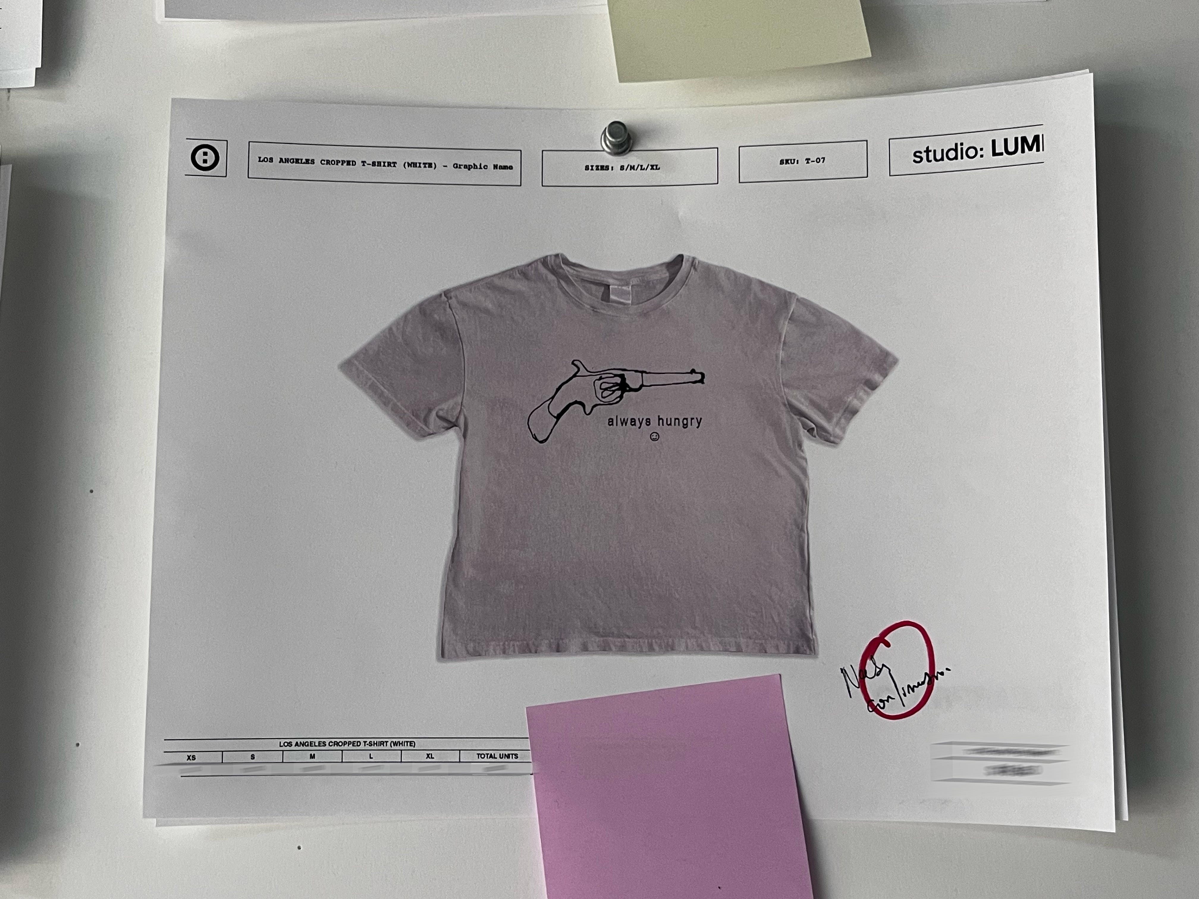
i’ve been on the fence about prints because i genuinely think graphics can either anchor a brand’s identity or completely tank it aesthetically. i’m keeping the prints subtle for the most part, because my personal style recently has been leaning modernist, as in i want construction and fit to be the driving force. that being said i’ve also been at this weird crossroads where it’s hard to exist in that corner without accidentally seeming like a blanks brand, especially in current cultural trends where “minimal” gets mistaken for “quiet luxury.”
and then there’s the opposite corner… the instagram brand era where the zeitgeist rewards edgy, in-your-face screen prints on garments that (in my opinion) will likely end up in a landfill. i’m not trying to take a moral position here, but i’m just saying that’s not what i’m trying to build.
for this first delivery, i think we found a lane where the graphics feel intentional, subtle, and still fun. as someone who isn’t naturally a graphic-heavy person, my simplest test has been: can i see myself actually wearing this? as this experiment continue I’m really excited to start designing graphics specific to the smaller capsule collections that we’ll be releasing periodically after the initial launch.
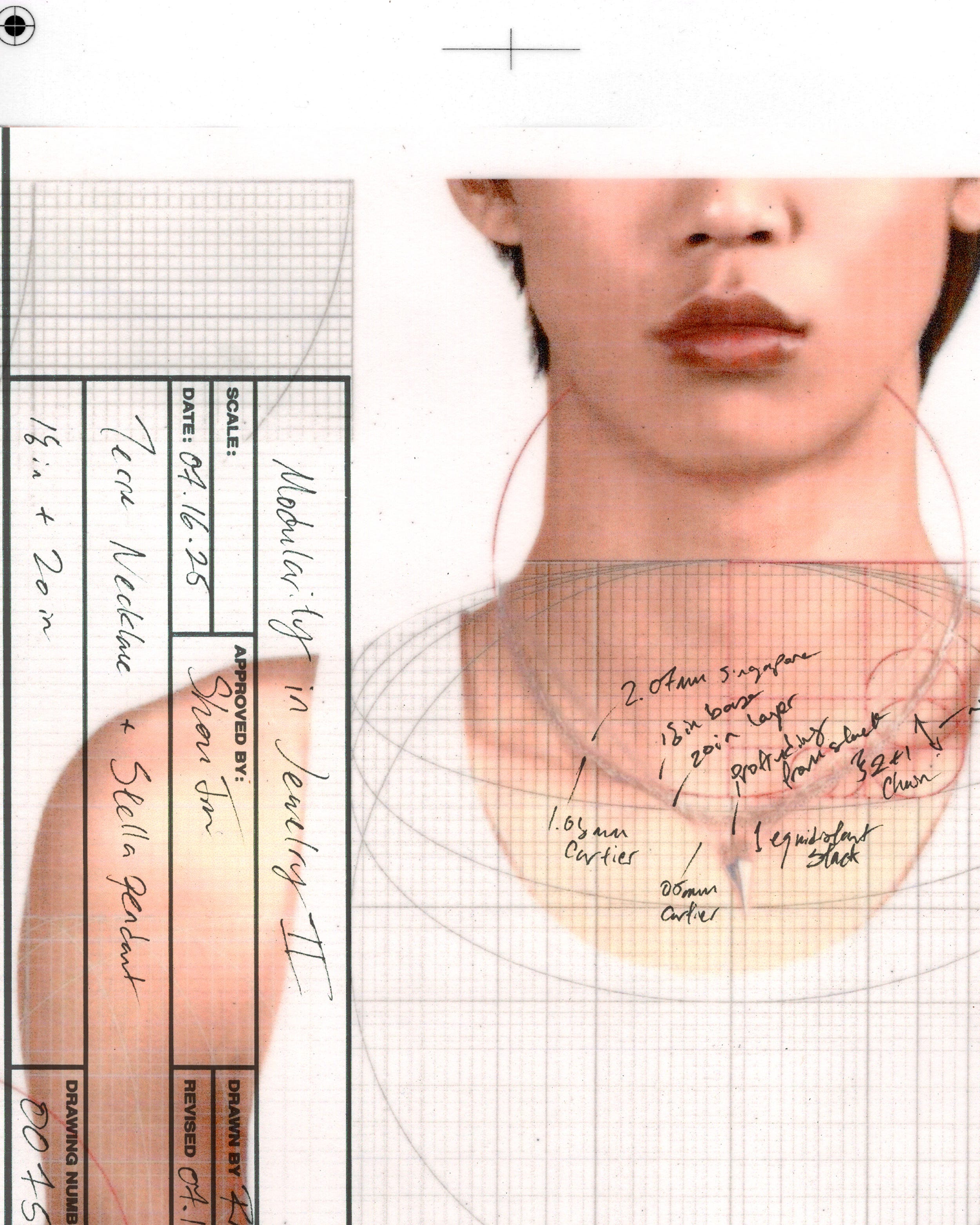
in parallel, i’m wrapping up a jewelry collection right now too. i’ve teased it on here and on instagram, and i’m in that final phase where you’re crossing your t’s on choices that seem boring until you realize they decide the entire vibe. chain decisions have been one of those things for me lately, because the chain isn’t an accessory to the piece, it’s the glue that holds it together, as it dictates where the pendant sits and how the look flows in contrast to your body.
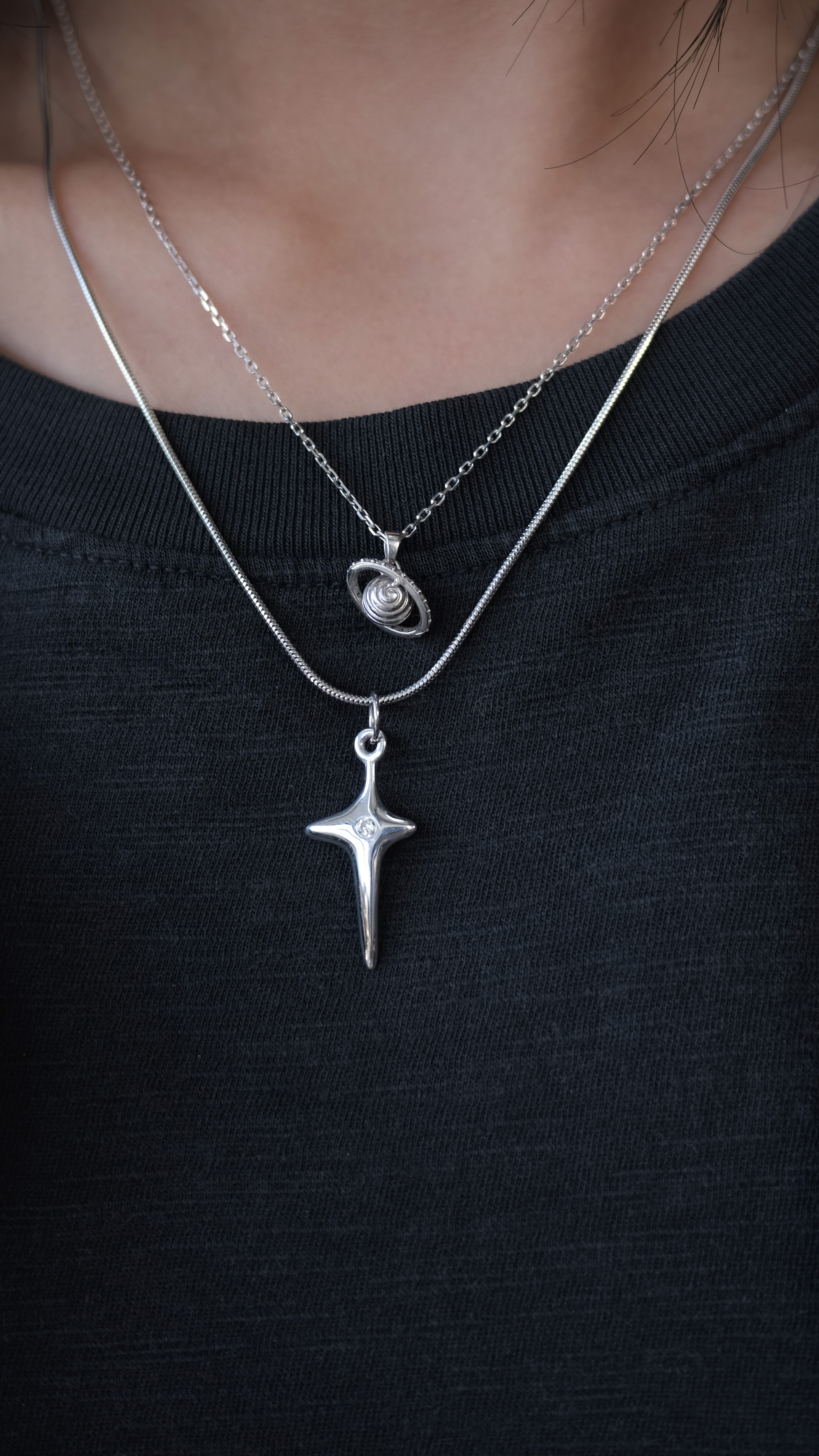
the deeper i get into chain design, the more i realize i learned how to design from a country i’ve never been to… and that’s basically the only reason my chains lie flat on a real clavicle. i didn’t set out to “study danish design,” but somehow the books on my desk, the chairs i sit on, the shapes on my reference shelf ended up being like ninety percent danish, and i didn’t even consciously choose it. it just kept happening, and eventually i had to ask why.
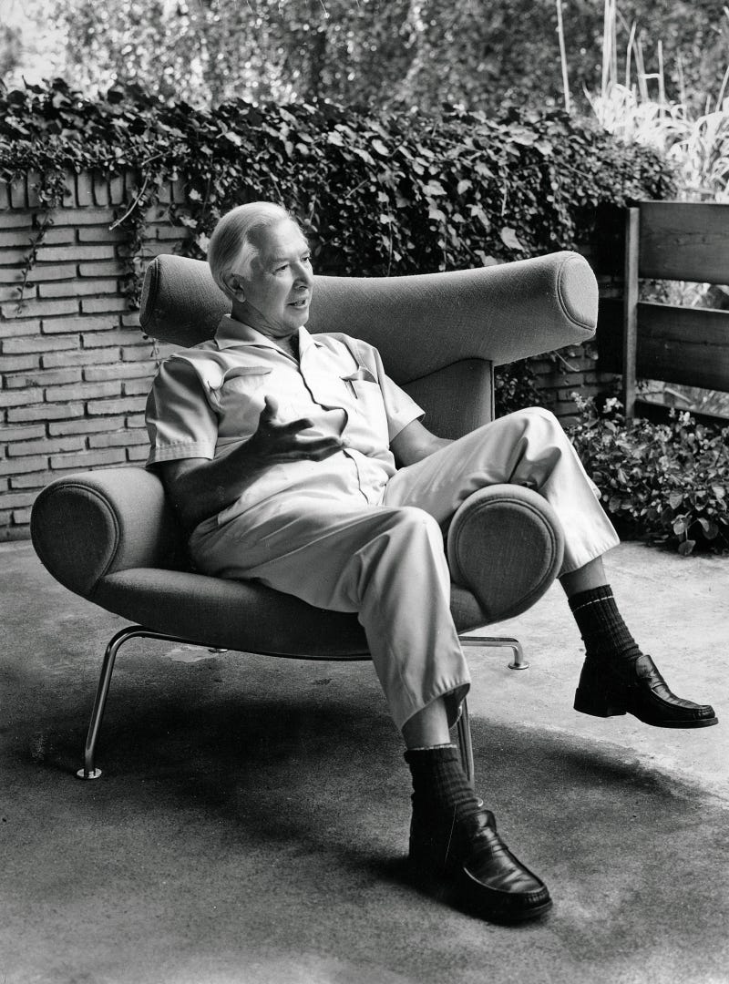
when i finally looked into it, it clicked that what people call “danish design” isn’t really a style… it’s a school of thought built by a small group of people, in a small country, after a war. once you see it that way, the whole “national character” thing starts to fall apart, and what’s underneath is way more useful: a method. kaare klint taught a whole generation to measure the human body, measure what already works, and redraw until the object integrates with the person using it. and that idea of integration as the real work is what i keep coming back to, because it’s the opposite of designing from a moodboard.
the part that stays stuck in my head is how they did all of this without needing obvious identity markers. there’s nothing on a wegner chair that says “danish,” nothing on silverwork that says “nordic,” and you can still recognize it from across a room because the object is designed around the body and the conditions it lives in. the chair integrates with the sitting body. the silver integrates with the light hitting it. the identity isn’t painted on. it’s built into how the thing behaves.
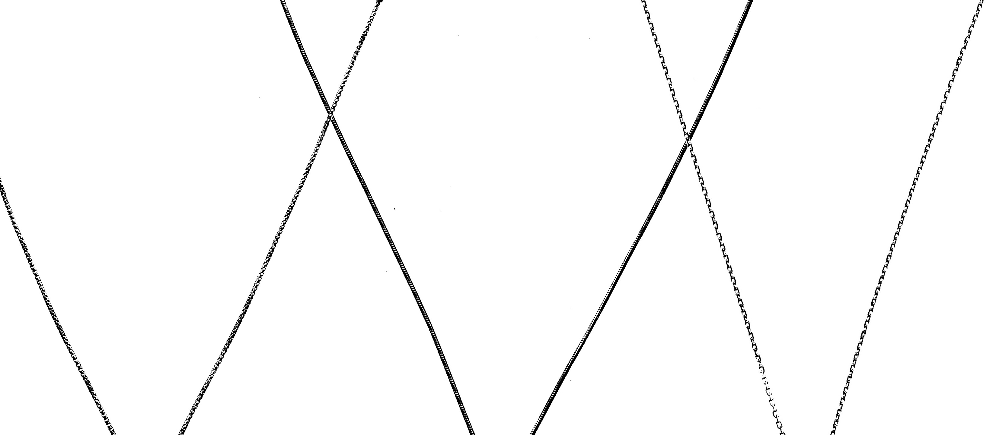
so when i bring that back to lumiyre chains, the “danish” part isn’t an aesthetic reference. it’s a discipline: design the join between the object and the body. and for chains, the join is unforgiving as the clavicle isn’t a flat line. it curves, it dips at the sternal notch where the chain pools, and it rises toward the shoulder, and every link either flows or fights it. most chains don’t pass that test, and i’ll admit the first six months i was picking chains by how they looked on a flat lay, which is literally the wrong test. now every chain sample has to earn its place through behavior… how it rolls on paper, how it twists, how it settles on different frames and different postures, and whether it rides up like it’s trying to escape.
and what’s been satisfying is realizing this is the same mindset i’m trying to protect on the clothing side too. the reason i’m so cautious about graphics isn’t because i hate prints, it’s because i want the character to come from the join. the way a tee sits on the shoulder, the way a sleeve breaks after wash, the way a denim pattern either flows with the body or doesn’t. when you design the join, you don’t have to scream identity. you can’t put a flag on a chain, but you can measure the clavicle it’s going to live on. if you do that work properly, the object starts to feel like it has a home.
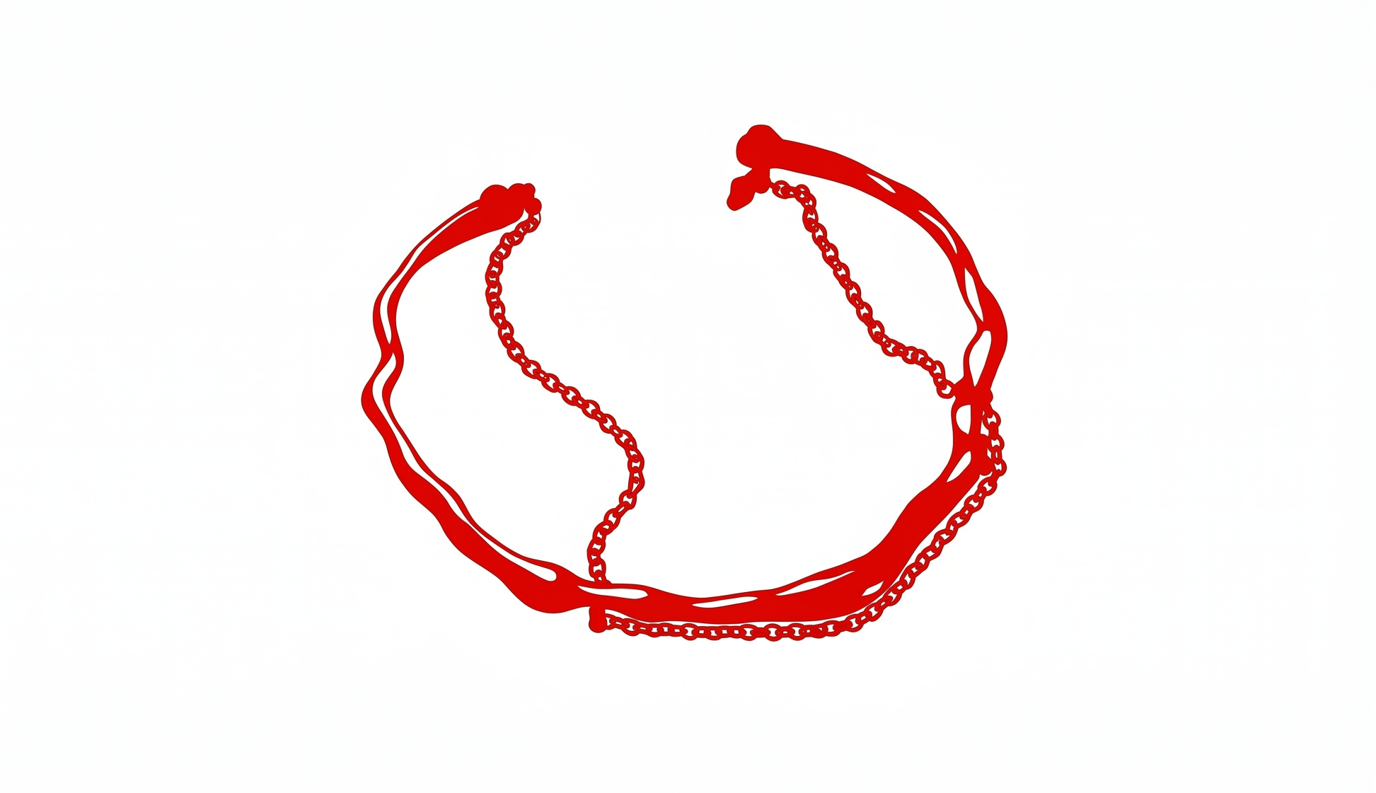
if you’ve made it this far, i want to tease something i know a lot of you guys have been waiting for… i’m bringing back the [ liquid permanent bracelet ]
i was going to keep it as an in-store exclusive, but situations lined up where i’m going to have an influx of stock to put online in the very, very near future. with this run i made subtle design changes to match the new finishings we’ve been rolling out, really excited to show you guys when the samples come in.