![Shou Jin's [ FOUNDER'S DIARY ]](https://substackcdn.com/image/fetch/$s_!DXF_!,w_120,h_120,c_fill,f_webp,q_auto:good,fl_progressive:steep/https%3A%2F%2Fsubstack-post-media.s3.amazonaws.com%2Fpublic%2Fimages%2F0b5ca623-6bb6-4d10-91e1-4a6eeb393c72_3898x3898.png)
![Shou Jin's [ FOUNDER'S DIARY ]](https://substackcdn.com/image/fetch/$s_!7UUI!,e_trim:10:white/e_trim:10:transparent/h_108,c_limit,f_auto,q_auto:good,fl_progressive:steep/https%3A%2F%2Fsubstack-post-media.s3.amazonaws.com%2Fpublic%2Fimages%2Fa24e5e63-6fd9-436f-a003-b16d44e23d5e_4443x2290.png)
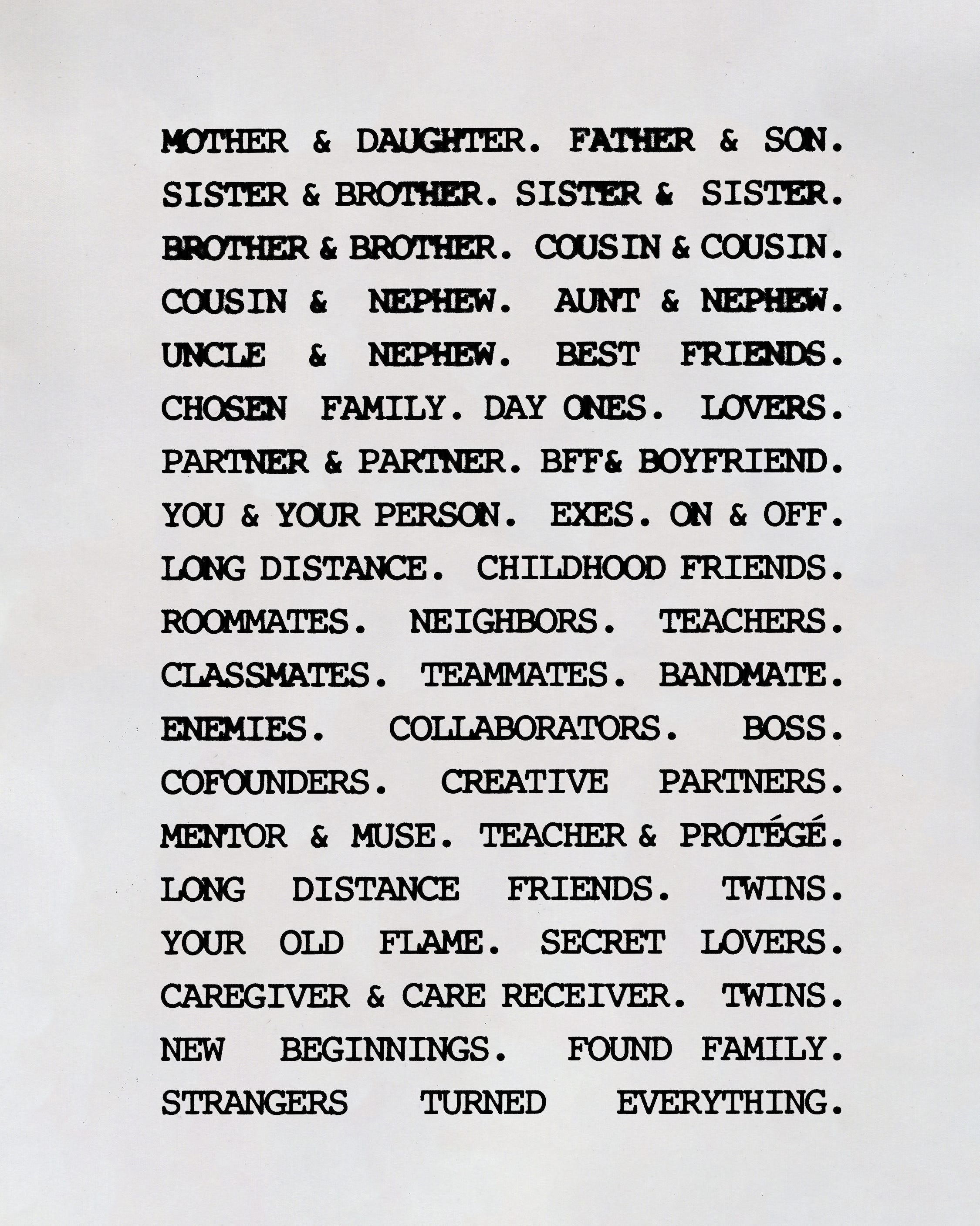
#014 - [ DESIGNING CONNECTION ]
you don’t design connection perfectly. instead you design toward it... you keep refining until the object can hold up to the meaning you wanted it to carry...
hello substack — it’s been a while.
i took a three-week break from writing because i needed to put my head down and finish two releases under our wishbone capsule: [ macroscopic ] and connection. the truth is, most of my brain lately has been swallowed by marketing, logistics, and all the unglamorous parts of getting a drop across the finish line, and i didn’t want to show up here sounding like a sales email. i’m finally back in the right headspace to talk about what we made, and what went wrong while making it.
i’ve also been busy finishing the last couple steps for the launch of our clothing line studio: LUMI. because of that, i put together a short survey for a small group of customers whose taste and perspective i really value. if you have a few minutes to fill it out, it would genuinely help us as we navigate the next step.
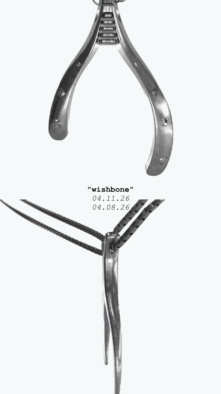
at the center of these releases were two pieces… the LIEN WISHBONE PENDANTS and the ECLAT WISHBONE PENDANT. if you’ve been following along, you know these weren’t quick ideas… both (separately) took over a year to develop. the question underneath all of it was: how do i design the feeling of connection? not just represent it, but make it physical.
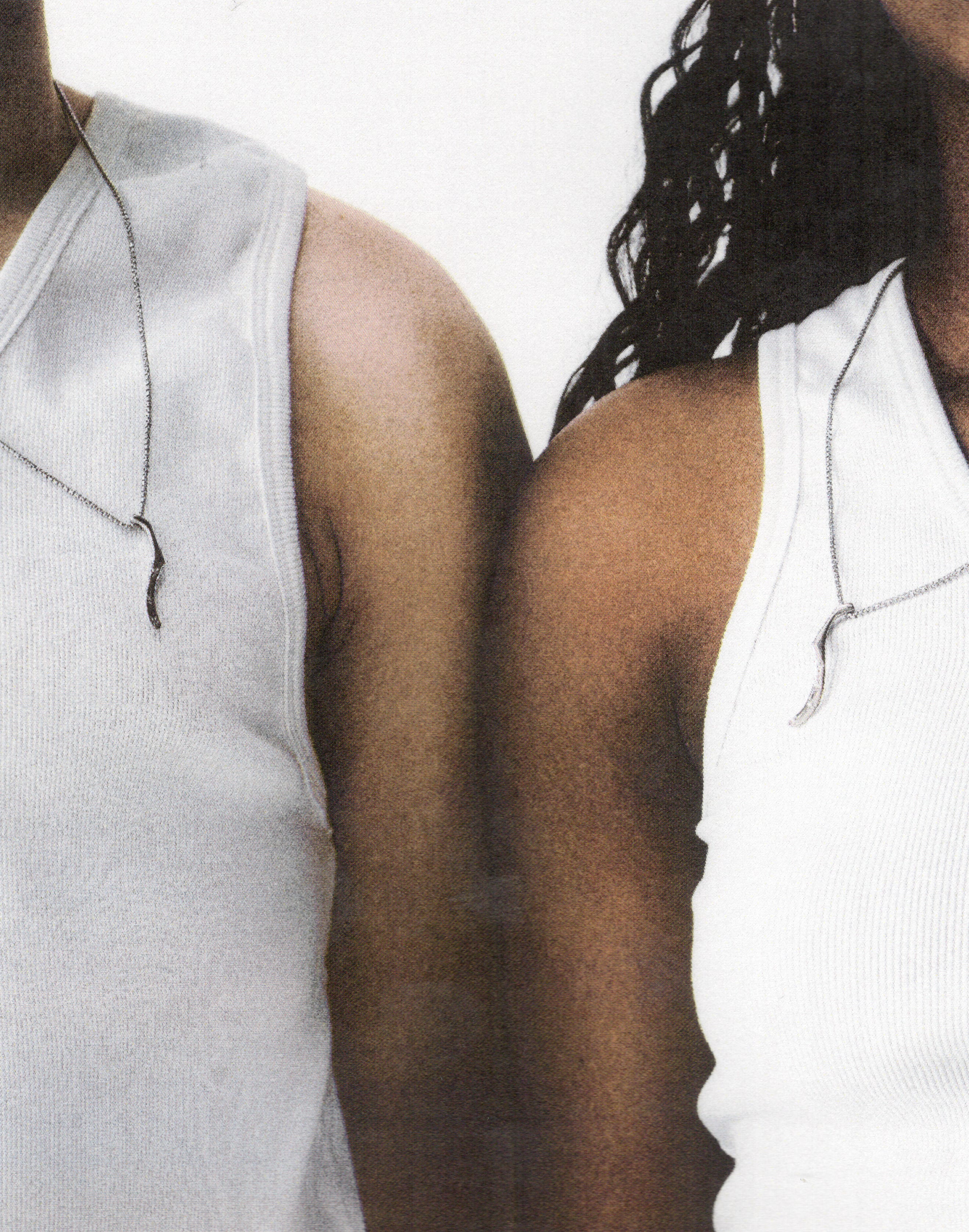
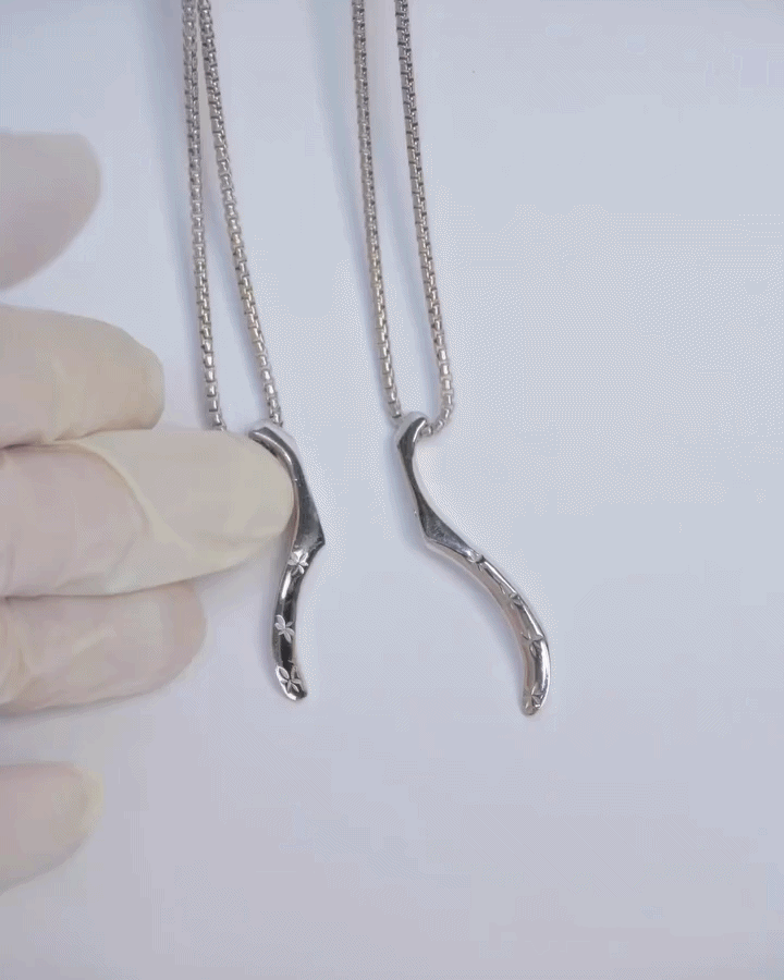
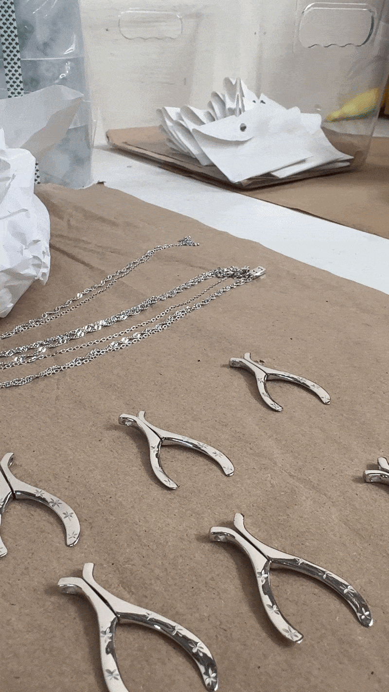
for LIEN, that question led us to magnets. each set includes two wishbone halves and two 1.76mm box chains, so the piece is meant to be shared by two people. a rare earth neodymium magnet pulls the halves back into a complete wishbone. so conceptually it’s built around shared serendipity. like a wishbone is usually broken between two people but only one person gets the wish, and we wanted to reimagine that gesture as something a bit more, where luck isn’t worn by just one person but rather divided, then carried, and then shared.
for the connection campaign, we opened casting to our community and invited people to come into our LA studio with someone meaningful to them. that decision ended up shaping the entire project. twins, parents and children, best friends, fiancées, husbands, chosen family. everyone came in carrying their own version of closeness.
the shoot became less about “models” and more about observing how people naturally exist around each other. it felt like the most honest way to launch a piece that’s literally designed to belong to more than one person.


this drop also taught us a hard lesson in execution. this was the first time both we and our partners in italy had worked with magnets in this exact way, and new mechanisms always look cleaner in CAD than they feel in production. the magnets require a perfectly sized cavity, but silver has a natural standard deviation (((so there’s always slight variance))). on top of that, the magnet and glue have to be placed by hand into a tiny space, which means small inconsistencies can become failures when the product is shaken around in transit. about 20% of the shipment arrived with magnets falling out, and after i spent a full day at the warehouse doing intense QC, i defected out another 10%. so yes, we sold out quickly, but there were fewer clean units than there should have been. the bright side is that our guys in italy found a way to optimize the process after the fact, so future restocks shouldn’t run into the same issue.
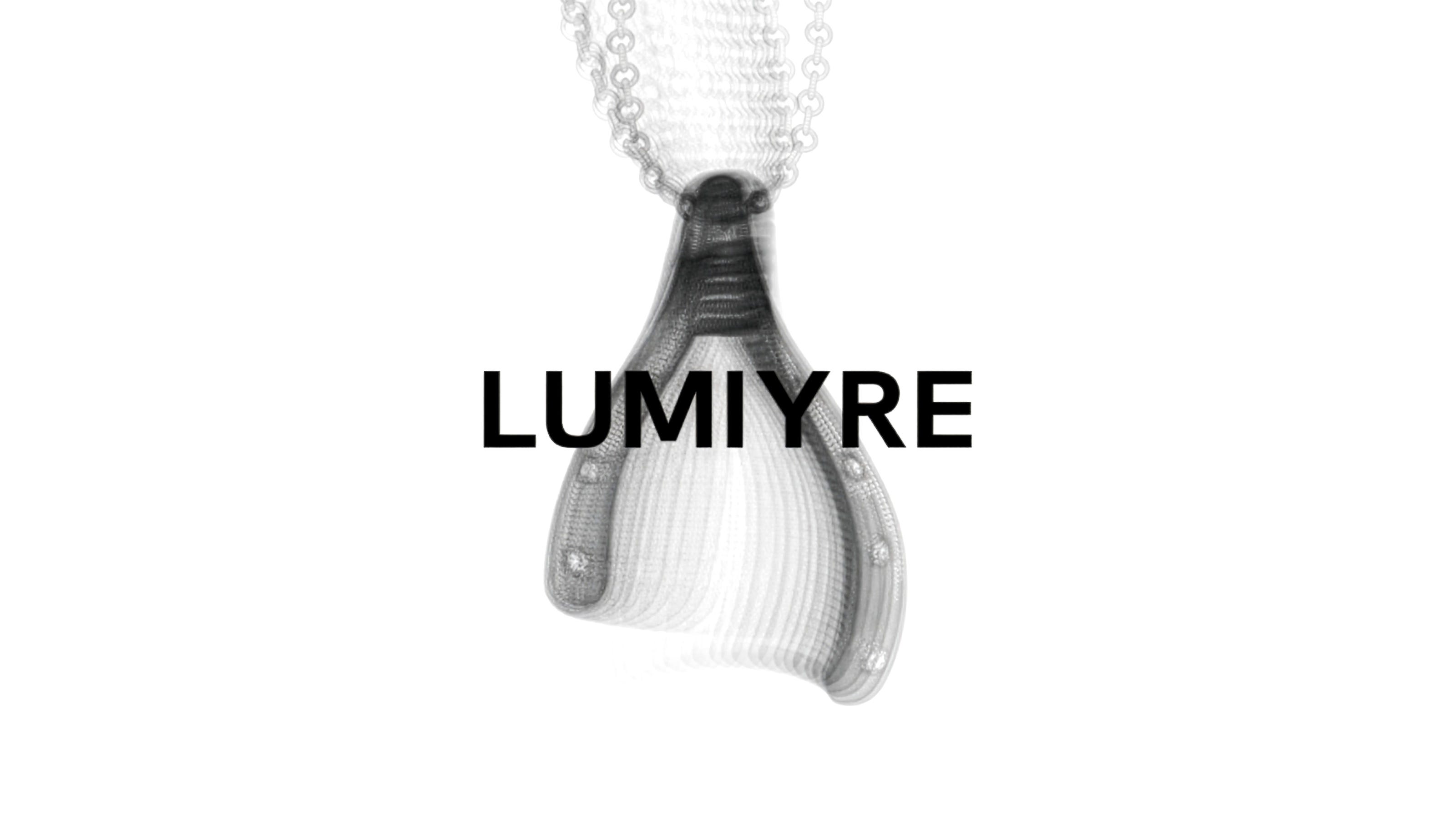
a week later we released the ECLAT WISHBONE PENDANT, which sits under the [ macroscopic ] capsule, and carries a completely different energy. i’ve wanted to use diamonds in our work for a long time, but i couldn’t find a supplier i trusted at a price that wouldn’t feel crazy for our customers, so the idea stayed shelved until late last year. that’s when i found a source for lab diamonds that felt right, and it opened the door to building what became our most expensive piece so far at $265, meant as an upgrade for people who wanted a step beyond the ASTRE PENDANT. the pendant keeps the wishbone silhouette but replaces the engraved stars with lab 16 carat V.S.–V.V.S. grade diamonds, and we increased the amount of silver to properly support the setting.
the [ macroscopic ] campaign was built like a fictional art gallery because as our introduction into luxury gems, we wanted to frame the pendant as, studied, and intentionally presented. instead of relying on a single hero image, we used mixed media: photography, 3D rendering, scanner art, and vector graphics… referencing the advertising work of charles and ray eames, where each medium gives you a different way of looking at the same object. the goal was for the piece to move between object, artifact, and image, so the campaign felt closer to an exhibition than a traditional jewelry release.


looking back, the reason i think this capsule mattered to me is that both releases were trying to answer the same question from different directions. connection was soft, human, and literal. two people, two halves, a physical reconnection. [ macroscopic ] was studied and interpretive. taking a familiar form, elevating materiality, and building a visual system around how it’s presented. one asked how people stay close; the other asked how an object becomes an artifact. and somewhere between the two, i found a more honest answer to the question i started with:
you don’t design connection perfectly. instead you design toward it, you stress-test it in the real world, and you keep refining until the object can hold up to the meaning you wanted it to carry.